Images
Images are an essential part of any design system. There is a plethora of information available elsewhere with regards to image best practices. Here we will focus on the approach we’ve applied for the Delta Design System.
Aspect Ratio
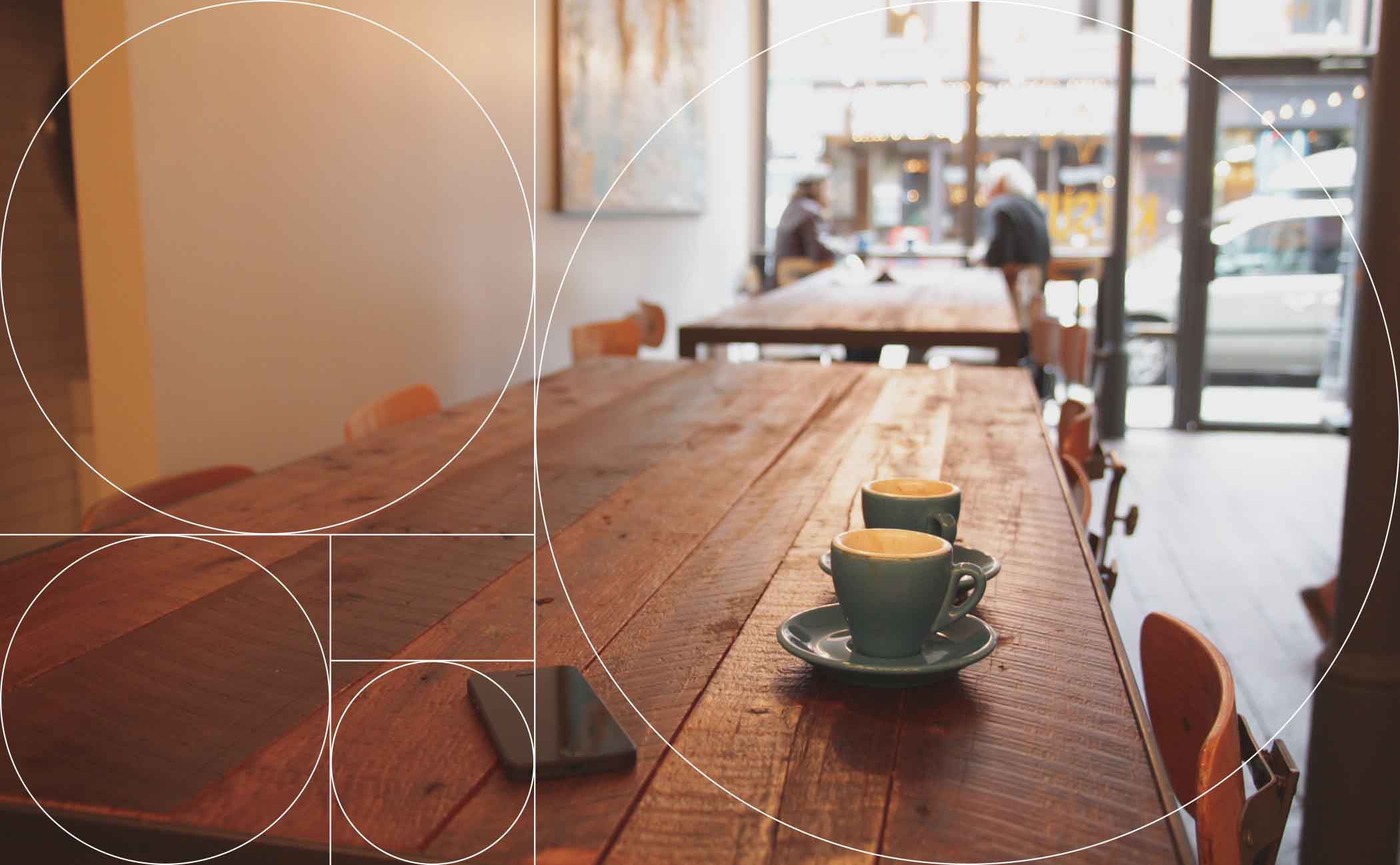
In keeping with other features of this design system, we believe that images should be sized and cropped according to the Golden Ratio.
Responsive Images
Okay… here’s where it gets a little tricky. There are several different ways to render responsive images, and rendering responsive images is the right thing to do. With the Delta Design System, we’re currently only using a solution for retina and non-retina displays.
Adding a srcset attribute to our <img> element enables us to present a high-resolution image only to retina devices and fall back to the low-resolution version for standard screens. The srcset attribute points to a list of alternative image files. The 1x tells the browser to display the lower-resolution image on standard-resolution screens. The 2x means that the higher-resolution image is used for retina screens. Older browsers that don’t understand srcset fall back to the src attribute.
<img src="../../assets/images/mountain-2-2x.jpg" srcset="../../assets/images/mountain-2-1x.jpg 1x, ../../assets/images/mountain-2-2x.jpg 2x" alt="Example of vertical golden aspect ratio image">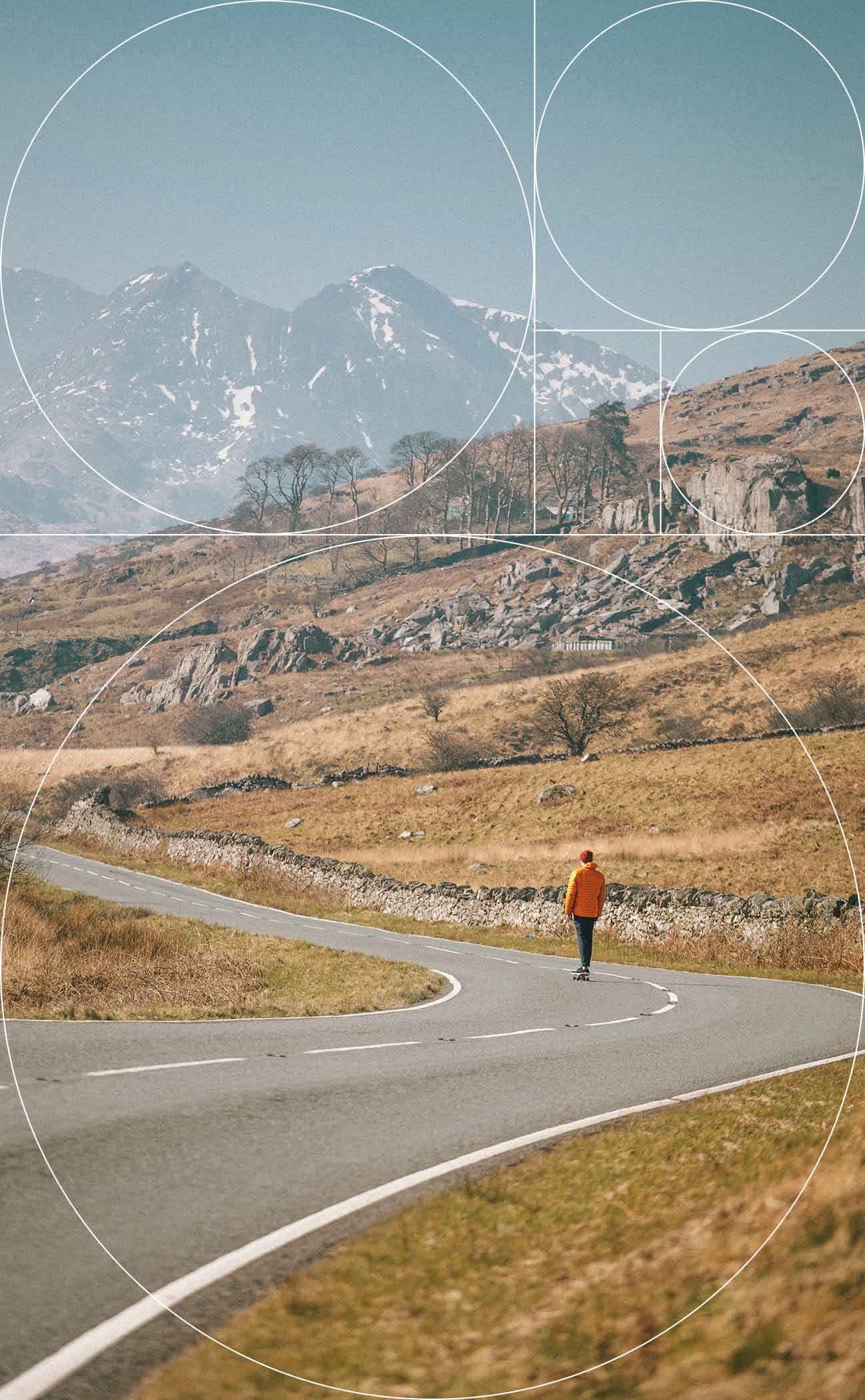
Important Guidelines
- Every
<img>you add to your site needs to have analtattribute. If the image is informational, set thealtequal to a descriptive alternative for that image. - If the image is decorative or redundant to adjacent text, set
alt="", which conveys to assistive technology users that the image isn’t necessary for understanding the page. - Avoid using generic strings like photo, image, or icon as
altvalues, as they don’t communicate valuable content to the user. Be as descriptive as possible.
We will add more options for images in a later phase of development, including options for art direction.