Gallery Grid
Inspired in part by Apple’s cover flow and the UX of some Apple TV apps, the gallery grid is a visual list of card-like elements.
At the moment, the gallery grid is a custom <ul> that spills out of the window horizontally enabling the user to scroll through entire list.
Gallery Grid Options
- Make any item in the list twice as wide by adding a
.doubleclass to the list item. - If you’d like to add some space between each grid item in the gallery, add a
.marginclass to the<ul>.
We’re continuing to work on an option that would enable you to wrap gallery grids so there is no overflow off the screen.
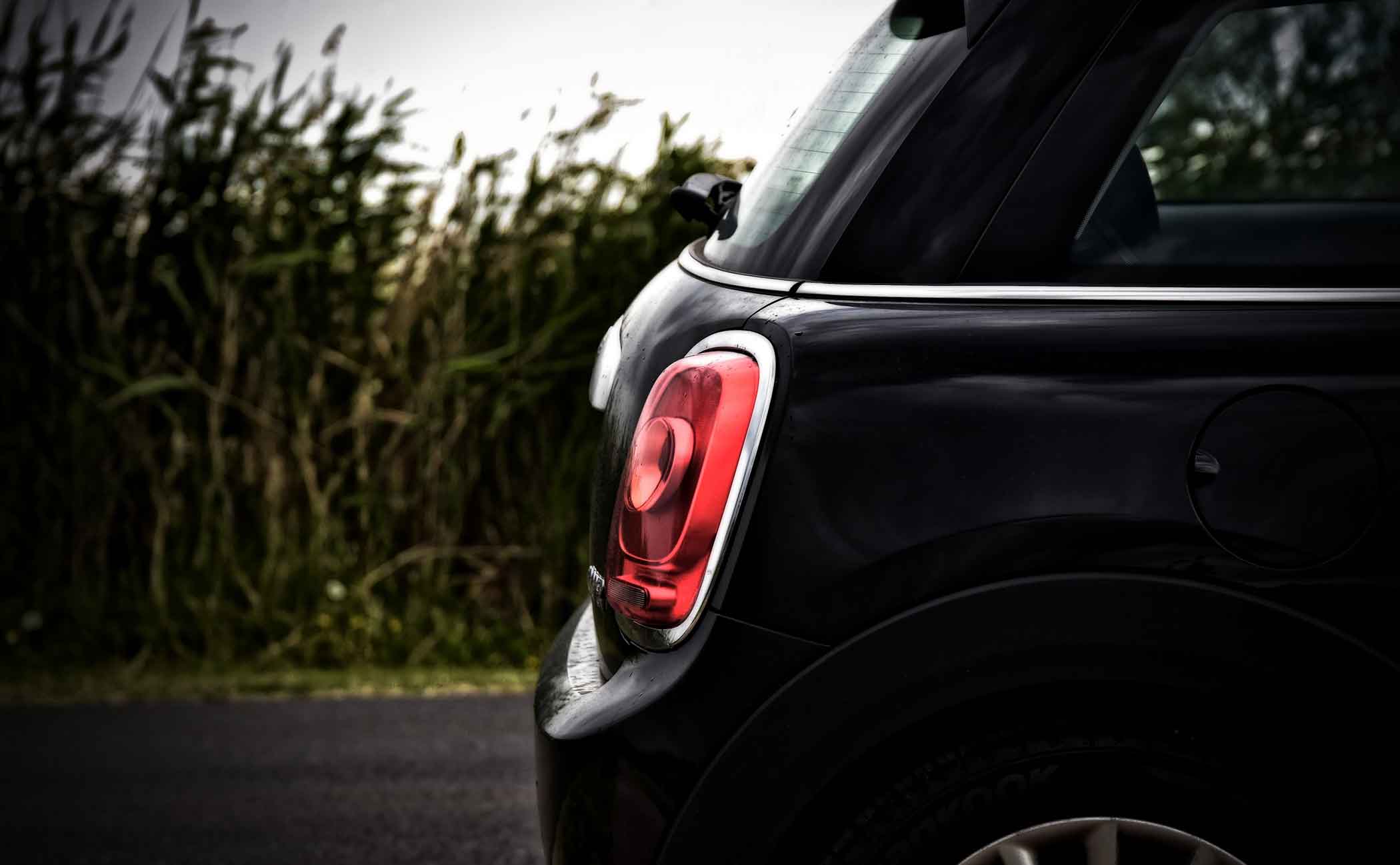
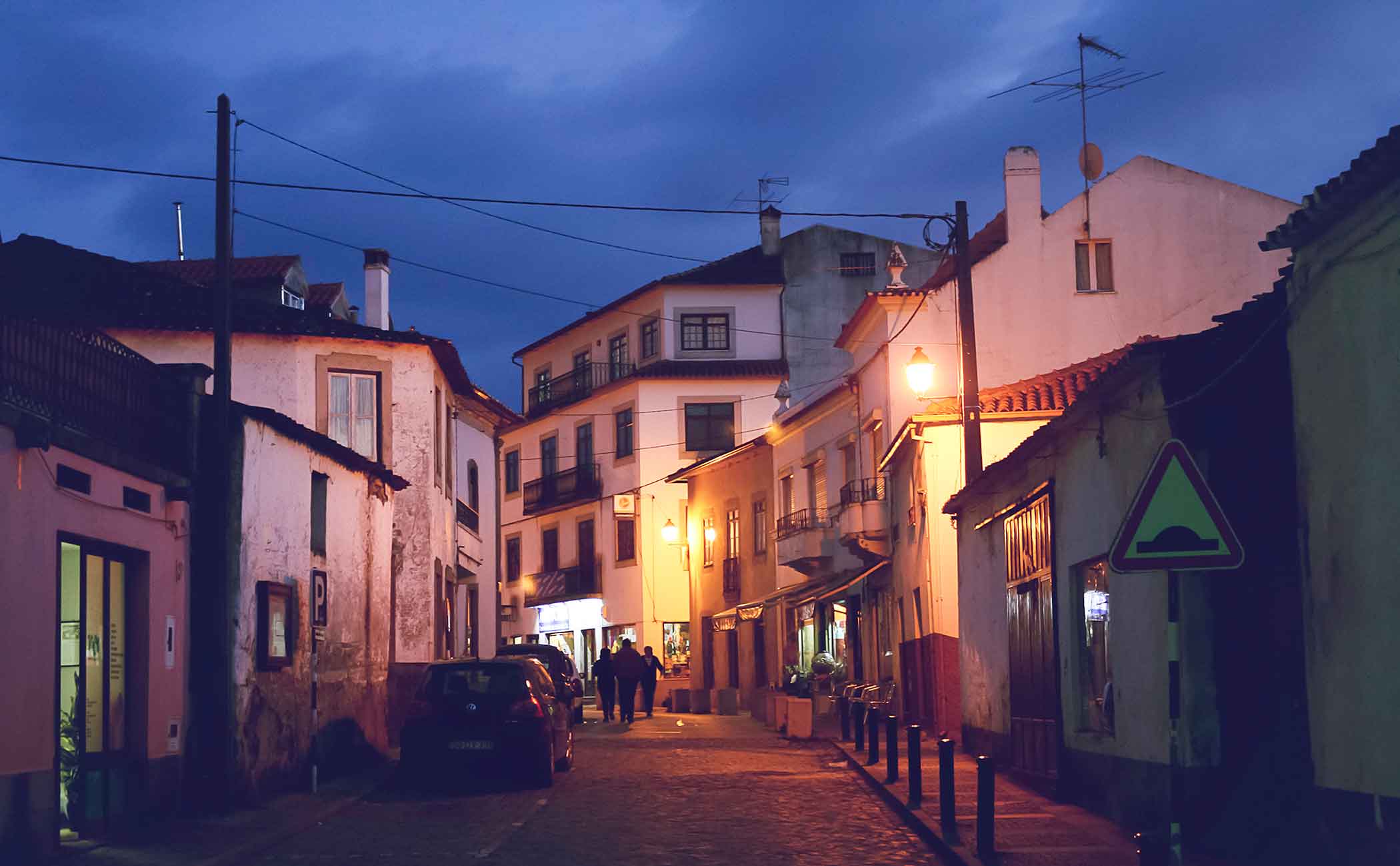
Gallery Grid Example


Gallery Grid Example Code
<div class="gallery-grid">
  <ul>
    <li><a href="#!"><img src="../../assets/images/bratislava-2x.jpg" srcset="../../assets/images/bratislava-1x.jpg 1x, ../../assets/images/bratislava-2x.jpg 2x" alt="Example of image used in gallery grid layout"></a></li>
    <li><a href="#!"><img src="../../assets/images/bridge-2x.jpg" srcset="../../assets/images/bridge-1x.jpg 1x, ../../assets/images/bridge-2x.jpg 2x" alt="Example of image used in gallery grid layout"></a></li>
    <li class="double"><a href="#!"><img src="../../assets/images/building-2x.jpg" srcset="../../assets/images/building-1x.jpg 1x, ../../assets/images/building-2x.jpg 2x" alt="Example of image used in gallery grid layout"></a></li>
    <li><a href="#!"><img src="../../assets/images/field-2x.jpg" srcset="../../assets/images/field-1x.jpg 1x, ../../assets/images/field-2x.jpg 2x" alt="Example of image used in gallery grid layout"></a></li>
    <li class="double"><a href="#!"><img src="../../assets/images/london-2x.jpg" srcset="../../assets/images/london-1x.jpg 1x, ../../assets/images/london-2x.jpg 2x" alt="Example of image used in gallery grid layout"></a></li>
    <li><a href="#!"><img src="../../assets/images/boston-2x.jpg" srcset="../../assets/images/boston-1x.jpg 1x, ../../assets/images/boston-2x.jpg 2x" alt="Example of image used in gallery grid layout"></a></li>
  </ul>
</div>