Headline
Media grid items are the perfect component to use when you need to create an easy to read table of contents.
Media grid blocks are a collection of media grid items and are the perfect component to preview content such as blog posts, user information, and more.
Media grid items are the perfect component to use when you need to create an easy to read table of contents.
Media grid items are the perfect component to use when you need to create an easy to read table of contents.

Media grid items are the perfect component to use when you need to create an easy to read table of contents.
<div class="media-grid-block">
<div class="media-grid-item">
<figure>
<img src="../../assets/images/bridge-2x.jpg" srcset="../../assets/images/bridge-1x.jpg 1x, ../../assets/images/bridge-2x.jpg 2x" alt="Example of image used in card layout">
<figcaption><cite><a href="https://www.stockio.com/free-photo/bridge-mason-jones" target="_blank">Bridge</a> by Mason Jones</cite></figcaption>
</figure>
<div class="text">
<h2>Headline</h2>
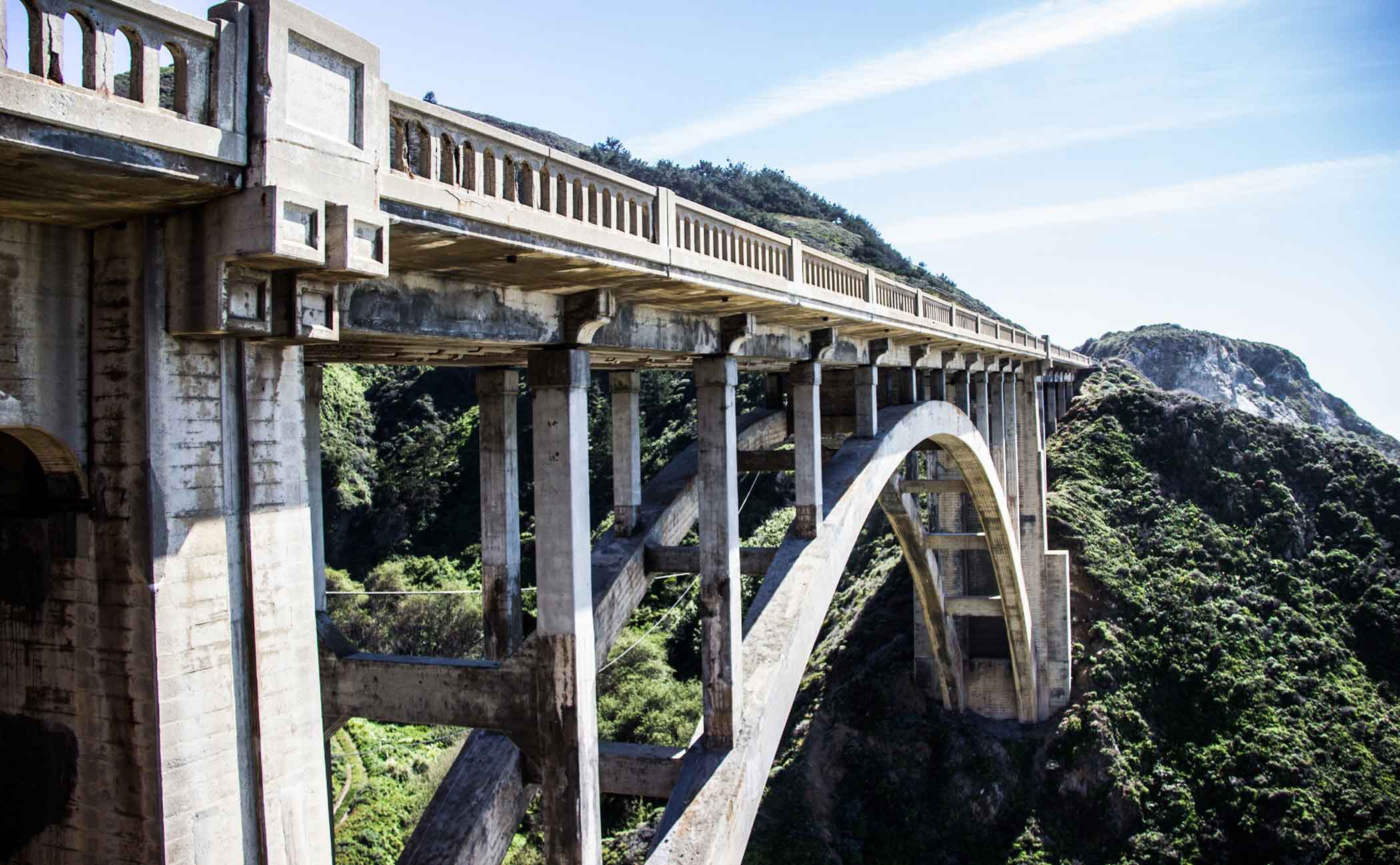
<p>Media grid items are the perfect component to use when you need to create an easy to read table of contents.</p>
<p class="icon"><a href="#!">Learn more<span><svg xmlns="http://www.w3.org/2000/svg" viewBox="0 0 24 24" width="24" height="24"><path fill="none" d="M0 0h24v24H0z"/><path d="M16.172 11l-5.364-5.364 1.414-1.414L20 12l-7.778 7.778-1.414-1.414L16.172 13H4v-2z"/></svg></span></a></p>
</div>
</div>
<div class="media-grid-item reverse">
<figure>
<img src="../../assets/images/building-2x.jpg" srcset="../../assets/images/building-1x.jpg 1x, ../../assets/images/building-2x.jpg 2x" alt="Example of image used in card layout">
<figcaption><cite><a href="https://www.stockio.com/free-photo/building-coen-van" target="_blank">Building</a> by Coen Van</cite></figcaption>
</figure>
<div class="text">
<h2>Headline</h2>
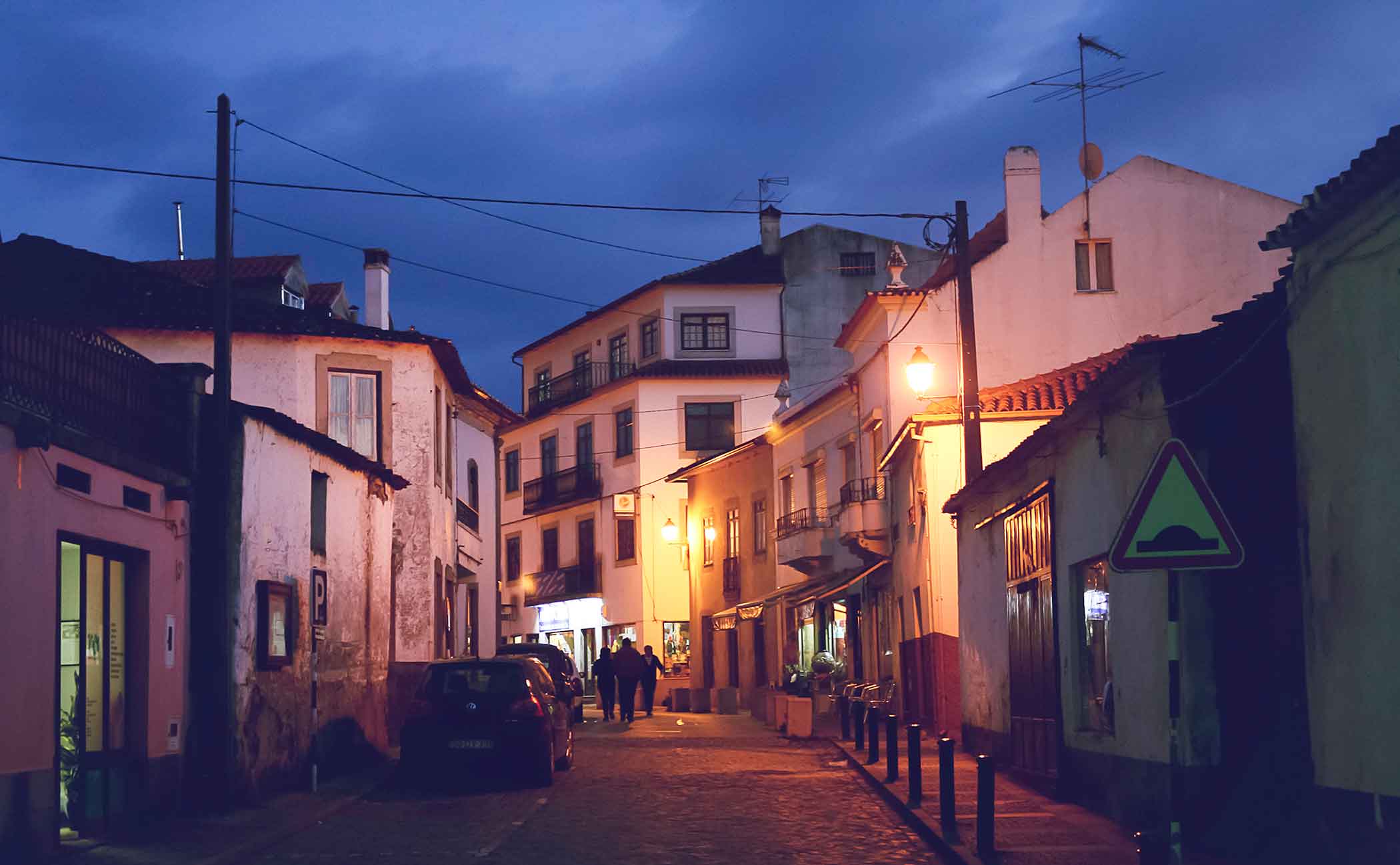
<p>Media grid items are the perfect component to use when you need to create an easy to read table of contents.</p>
<p class="icon"><a href="#!">Learn more<span><svg xmlns="http://www.w3.org/2000/svg" viewBox="0 0 24 24" width="24" height="24"><path fill="none" d="M0 0h24v24H0z"/><path d="M16.172 11l-5.364-5.364 1.414-1.414L20 12l-7.778 7.778-1.414-1.414L16.172 13H4v-2z"/></svg></span></a></p>
</div>
</div>
<div class="media-grid-item">
<figure>
<img src="../../assets/images/field-2x.jpg" srcset="../../assets/images/field-1x.jpg 1x, ../../assets/images/field-2x.jpg 2x" alt="Example of image used in card layout">
<figcaption><cite><a href="https://www.stockio.com/free-photo/field-konrad-marx" target="_blank">Field</a> by Konrad Marx</cite></figcaption>
</figure>
<div class="text">
<h2>Headline</h2>
<p>Media grid items are the perfect component to use when you need to create an easy to read table of contents.</p>
<p class="icon"><a href="#!">Learn more<span><svg xmlns="http://www.w3.org/2000/svg" viewBox="0 0 24 24" width="24" height="24"><path fill="none" d="M0 0h24v24H0z"/><path d="M16.172 11l-5.364-5.364 1.414-1.414L20 12l-7.778 7.778-1.414-1.414L16.172 13H4v-2z"/></svg></span></a></p>
</div>
</div>
</div>